
A good User Interface is not the one with a lot of animations, colors or fancy components.
It is the one where a user can open a screen and immediately understand what to do where to go and what will happen next. Think about the apps and websites you use every day. You probably do not. Think about how to use Google Search how to filter a property on Airbnb or how to navigate a familiar mobile app? But You simply do it.
That feeling of “I know what to do” is one of the biggest signs of good UI design.
Good UI design is about making digital experiences simple clear consistent, efficient and comfortable to use.
Here are 10 principles that can help create interfaces that users understand naturally.
1. Keep the UI Simple and Clear
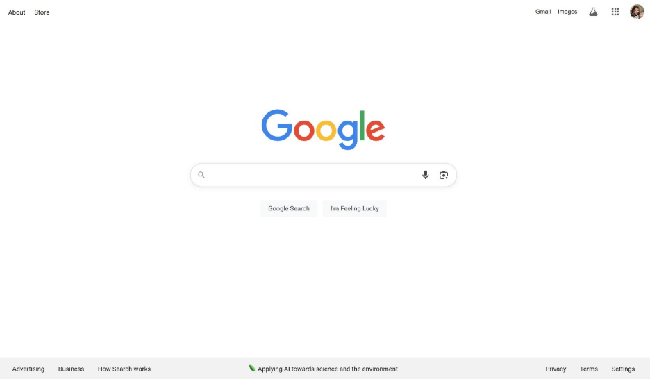
A good user interface should be simple enough that people know what to do without stopping to think about it. The screen should have a goal, with only the things that are really helpful. Google Search is an example it keeps the search experience centered on one main thing without extra distractions.
- A good user interface should be simple and focused.
- A good user interface should make the main action easy to see.
- A good user interface should remove things that are not needed.
- A good user interface should put content first instead of fancy stuff.
As a designer ask:
- Can users understand this screen within a seconds?
- Are there elements?
- Is the primary action obvious?
- Can anything be removed without affecting the experience?
Simple does not mean empty. Simple means purposeful.
2. Maintain Consistency
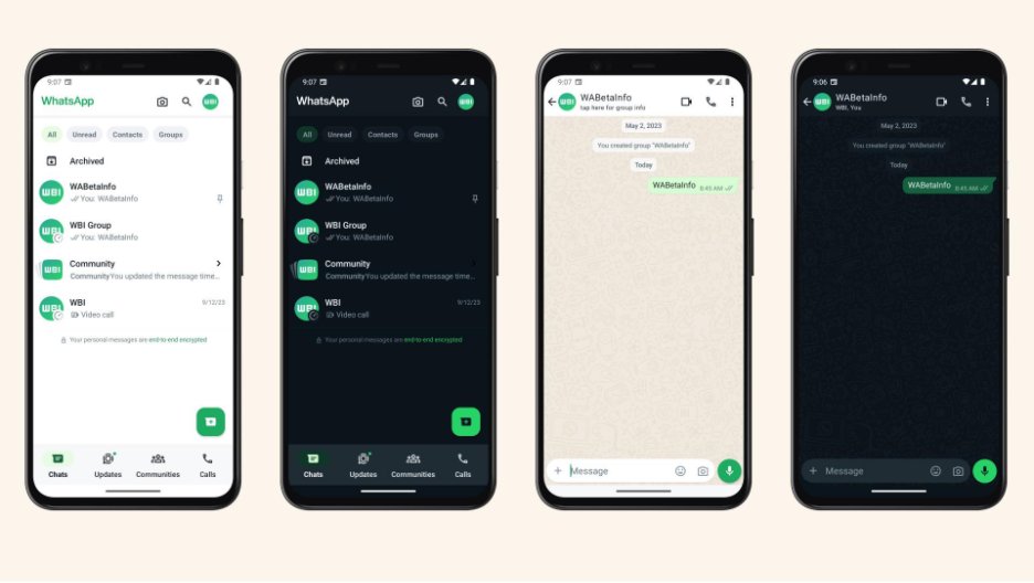
Imagine a website where buttons and things look really different from each other. This can be very confusing for people who use the website. Consistency helps people understand how to use a website because once they figure out how one thing works they can use that knowledge to understand the rest of the website. Consistency is really important for websites.
- We should make all our buttons look the same.
- We should use the fonts and colors everywhere on the website.
- We should leave the amount of space between things.
- We should make sure people can find their way around the website easily.
- We should use the parts over and over again when we design the website.
If two things do the thing on the website they should look and work the same way. This is what consistency is, about and consistency helps users understand the website, like the websites interface faster.
-向远公园-_-Step-Park.png)
3. Reduce Clicks and Give a Clear Output
A good user interface should help users complete a task with unnecessary effort. This does not mean that we should reduce every task to the possible clicks. Sometimes an extra step can prevent mistakes. Help users make better decisions. The real goal of an user interface is to make the journey feel smooth from the users action to a clear result.
- We should remove steps and effort from the user interface.
- We should group related actions together in the user interface.
- We should make the next step obvious to the users.
- We should give users a response after every important action they take.
- We should focus on the experience of the users not just the number of clicks they make.
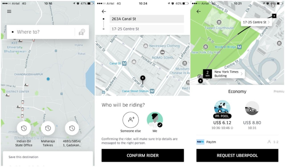
Example: When people search for a property, they can select the location then the budget, the property type and then search. Immediately after that they can see the properties. Airbnb does something by grouping filters together which makes it easier for users to refine their search without having to move through multiple screens. This is an example of a user interface that helps users complete a task with less unnecessary effort.
Remember: The user interface should work like this: the user takes an action the system responds to that action. Then the user gets a clear result, from the system. The user interface should always follow this pattern: user action, system response clear result.

4. Make the Interface User-Friendly
When you are using a website or a program for the time it should be easy to understand. You should not need to read a book to figure out how to use it. The interface should feel natural.
The words used on the website or program should be simple and easy to understand. Users should know what will happen when they click on something. For example the button should say “Delete account” of “Terminate user instance” because “Delete account” is easier to understand.
- The language used should be simple and familiar.
- Common actions should be easy to find.
- Do not use terms that are hard to understand.
- When a user does something they should get a message, about what happened.
- The interface should be designed so that it feels familiar and you know what will happen when you do something.
5. Use Visual Hierarchy
When you look at a screen you do not need everything to jump out at you. The visual hierarchy is like a map that shows the user what’s important. It helps the users eyes see the important things first then the other stuff and finally what they can do.
If you use small things, space, light and dark and where you put things on the screen in a smart way it can make the screen feel easy to look at.
You should ask yourself a question: What should the user notice first? Once you figure that out the rest of the screen should help the user see that thing. The visual hierarchy and the design of the screen should make it easy for the user to see what is important, like the hierarchy.

6. Prioritize Clarity Over Decoration
A looking interface can grab your attention but it is the clarity of the interface that makes it useful. A good user interface should help users understand what they are looking at what actions they can take and what will happen next without making them guess what to do. Even little things, such, as using “Continue to Payment” of just “Continue” can make what you need to do much clearer.
The goal is not to decide between being creative and making the user interface easy to use. The best user interface combines both. It looks good and it is easy to use. The design looks good and feels easy to use.
7. Give Users Control
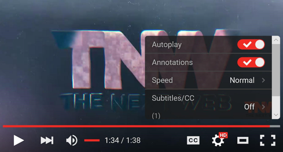
The interface should be easy to use. Not make users feel stuck. A good interface gives users the freedom to change their mind fix mistakes or stop what they are doing when they want to. Having options like Back Undo, Edit, Cancel, Close and Reset makes users feel better because they know they can fix things if something goes wrong.
- Give users a way to go back or cancel.
- Allow users to edit or undo things they have done.
- Provide options to close or reset when users need to.
- Do not trap users in a situation they do not want to be, in.
- Make users feel confident when they are using the interface.
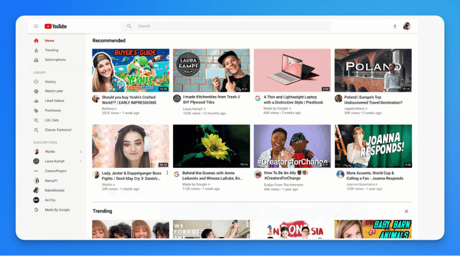
Youtube :
8. Use Aesthetics and Minimal Design Together
Aesthetics & Minimal Design
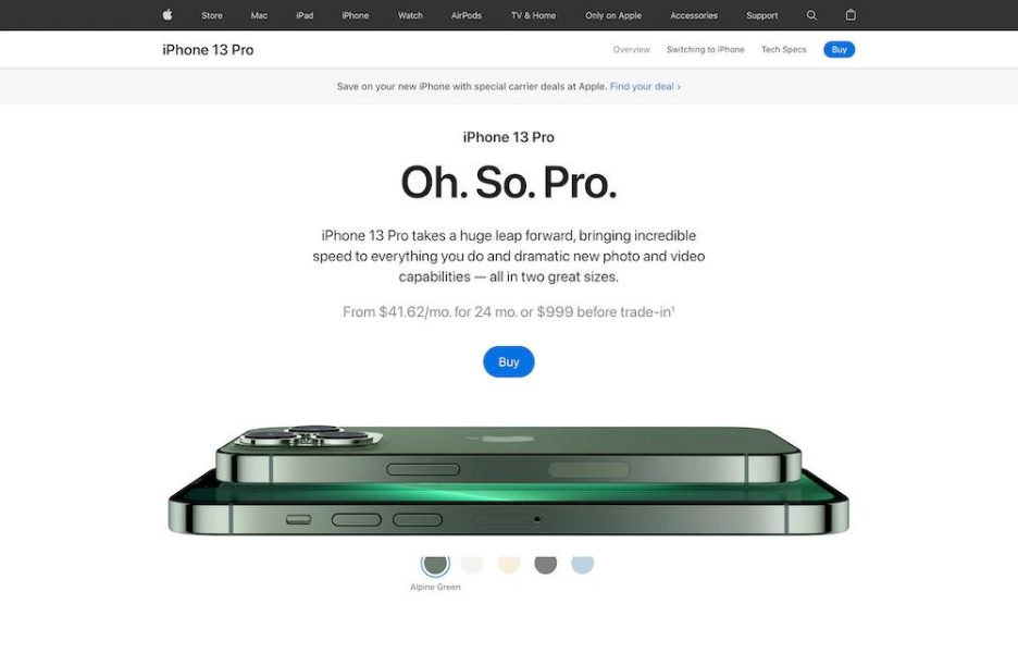
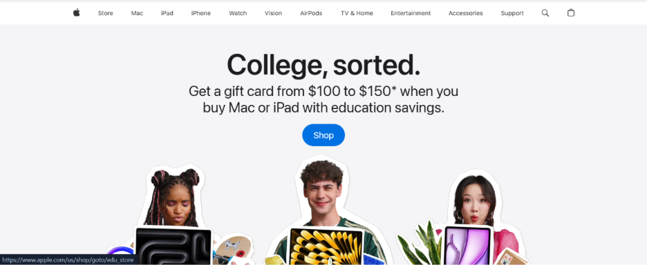
Minimal design isn’t about removing everything from the screen. It’s about knowing what deserves attention and what doesn’t. Apples interface design is an example of this approach—clean layout, generous spacing, clear typography and carefully chosen visual elements allow the product and its key actions to remain the focus.
The idea is simple: don’t add an element just because you can. Add it because it improves the user’s experience.
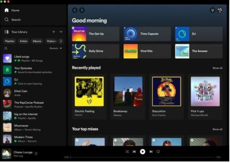
Spotify
Example : Apple UI
9. Design for Different Screen Sizes
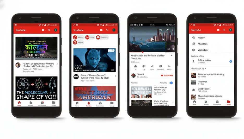
A design that looks great on a desktop can be really hard to use on a screen. People use desktop, tablet and mobile** devices so the interface has to work on each one. It cannot just get smaller.
A good design that works on all devices changes the **layout, content priority, navigation, typography, spacing and touch interactions** depending on the device you are using. Material Design does the thing. It works on different screen sizes and platforms.
The goal is simple: do not make the desktop design smaller. Make the experience work for how people use each device, like desktop, tablet and mobile devices. This way desktop, tablet and mobile users can all use it easily.
10. Design for the User, Not the Screen
When we make a user interface it has to be helpful to people. A user interface can look really good. It is not good if it does not help people do what they want to do. We should think about the user who are the users what do the users want to do and what might make it hard for the users to do it.
We have to think about what happens when the users make a mistake or when the users need to change something. A good designer thinks about the experience of the user not just what is on the screen.
The main goal is not to make a screen that looks beautiful. The main goal is to make something that works well for the user. We want to design an experience that’s good, for the person who is using it and that is what we should focus on when we design for the user.
Bringing It All Together
These principles do not work on their own. They work together to make an interface that feels like it is a part of you.
Simplicity makes things easy to understand. Consistency helps you learn how to use it. The visual hierarchy shows you what to look at and clarity makes it easy to do what you want without a lot of work. Having control, over what you’re doing makes you feel more confident and responsive design means it works well on your computer or your phone.
When all of these principles work together you get something good.
- It is not something that looks nice.
- It is something that feels easy to use it feels familiar. It feels like it is a part of you.
Final Thought: Good User Interface Gets Out Of The Way
The best user interface is not always the one that people notice.
User interface is good when it does what it is supposed to do. When a button is hard to find or an error message is confusing the user interface becomes a problem. But when everything works the way it should people do not think about the user interface they just keep going.
The real measure of an user interface is this:
- User interface is good when people can focus on what they want to do.
- They should not have to figure out how the user interface works.
- The user interface is doing its job when people can just do what they came to do.
- Because in the end a good user interface is not about making the user interface important.
- It is about making the user important.
- Good user interface gets out of the way. Lets the user do what they want to do.
- The user interface should help the user not get in the way.
- Good user interface is about the user, not, about the user interface itself.
Good user interface design is not about getting users to notice the design. It is about making the design feel so smooth that users can concentrate on the task they really want to do.
When the design’s easy to use clear the same throughout and made with real user needs, in mind the interface does not get in the way of the user. It gently helps them keep going.
“The best user interface is not the one users look at and say nice. It is the one users understand.”